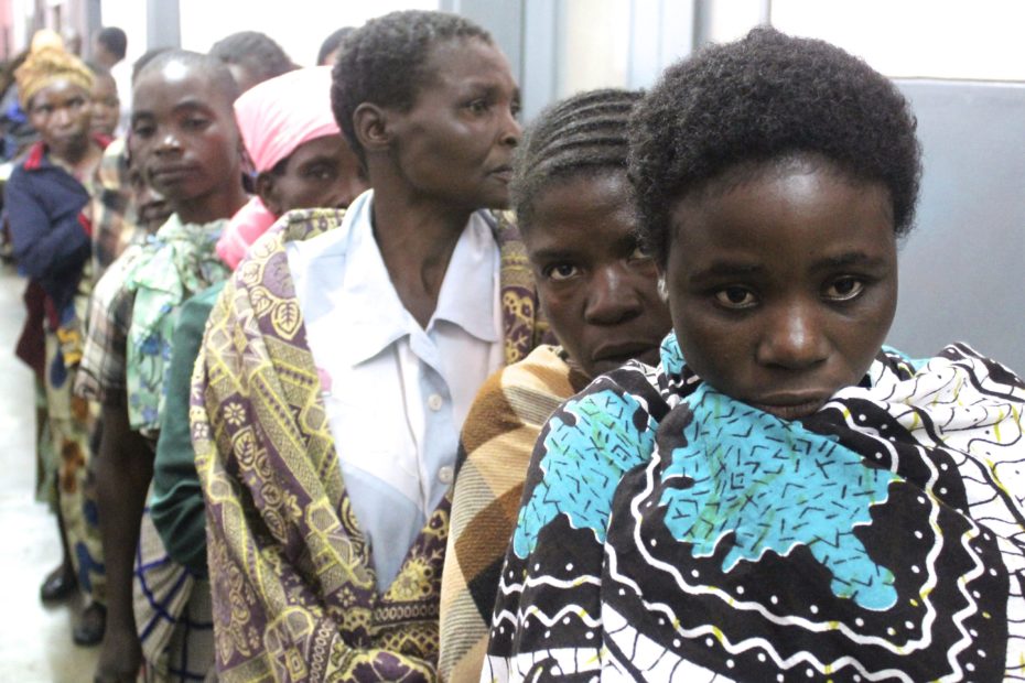
Despite international agreements and national laws, every year, 12 million girls are married before they are 18.
As more and more girls are married off in their youth, they are forced into sex, and endure horrific childbirths that, because of their undeveloped bodies, frequently result in obstetric fistula.
Yet these shocking truths are so distant that we can feel removed from them. As we attend the first day of this year’s Skoll World Forum, we thought it apt to share insight in accordance with their theme: “The Power of Proximity.”
Social justice activist Bryan Stevenson has previously said, “You cannot be an effective problem-solver from a distance. There are details and nuances to problems that you will miss unless you are close enough to observe those details.”
Enter Tableau.
Tableau allows us focus on being problem-specific. Pregnancy in adolescence, and the devastating impact it carries for the child mothers affected, is a growing concern which we can only begin to rectify once we navigate closer to where it is happening and observe the nuances that surround it.
- Our below visualization shows the extent of the problem. In the countries shaded bright orange, the rate of child mothers is at over 50%. This is especially severe in Sub-saharan Africa.
- In the two charts at the bottom, each dot represents one country.
- Displayed in the left chart, we can see which countries currently have treatment centers for fistula patients. There are large differences between the median percentage of child mothers in countries which have treatment centers and those that don’t. In other words, countries that are known to have an occurrence of fistula are also countries with a higher percentage of child mothers. Central African Republic, Niger, Chad, Angola and Mali sit at the top of the list of countries with the highest adolescent birth rate. We can presume that obstetric fistula is a large problem in these countries.
- The chart to the right of this shows that in most countries, the rate of child mothers is much higher for poorer parts of the population. Hover over a dot, to see how large the difference is between those in the poorest parts compared to the richest of society.
- Similar trends are seen in the difference between urban and rural areas, in the chart to the right of the map, where only a handful of countries have more teenage mothers in urban areas.
Hover over any part of the visualization to highlight the same country in all charts. Note that numbers at the income and region level aren’t available for all countries. Data collated by Unicef.
